Chart Properties
The Chart Properties pane lets you customize the view of your data. To view the Chart Properties pane, click ![]() .
.
The Chart Properties pane consists of the following tabs:
Chart Tab
Use the Chart tab to customize titles, legend, tooltip, group series, and logarithmic scale.
The options in the Chart tab will change based on the selections in the Data tab and the dataset.
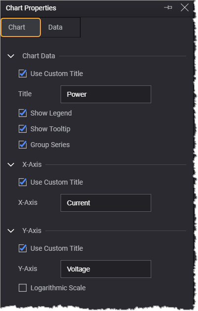
| Chart Data | |
|---|---|
| Option | Description |
|
Use Custom Title |
Allows you to provides a custom chart title. |
| Show Legend | Displays a legend in the chart area. |
| Show Tooltip | Displays trace values when you mouse over the plotted data. |
| Group Series | Displays the chart with consolidated y-axis data. This option is displayed when you specify multiple y-axis in the Data tab. For more information, see Group and Ungroup Data Series in Charts. |
| X-Axis | |
| Option | Description |
| Use Custom Title | Allows you to provide a custom title for the x-axis. |
|
Logarithmic Scale |
Displays the chart in logarithmic scale in the chart area. This option is displayed when the x-axis data contains positive non-zero values. |
| Y-Axis | |
| Option | Description |
| Use Custom Title | Allows you to provide a custom title for the y-axis. |
| Logarithmic Scale | Displays the chart in logarithmic scale in the chart area. This option is displayed when the y-axis data contains positive non-zero values. |
Data Tab
Use the Data tab to select the chart type and dataset on the x- and y-axis. You can also filter and split the dataset to display data differently.
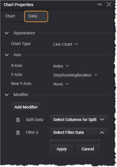
| Appearance | |
|---|---|
| Option | Description |
| Chart Type | Displays the selected chart type. Click the drop-down to select a chart types. For more information see Supported Chart Types. |
| Number of Bins | Allows you to specify the number of bins for the Histogram chart type. |
| Axis | |
| Options | Description |
| X-Axis |
Displays the selected dataset value plotted in the x-axis. Click the drop-down to select a data column for x-axis. |
| Y-Axis |
Displays the selected dataset value plotted in the y-axis. Click the drop-down to select a data column for y-axis. |
| New Y-Axis | Provides an option to plot multiple dataset values in the y-axis. |
| Modifier | |
| Option | Description |
| Add Split |
Provides an option to split the plotted data and/or create a legend to help differentiate each data point. For more information, see Split and Filter Data. |
| Add Filter | Provides an option to filters data by dataset to be viewed in the plotted data. For more information, see Split and Filter Data. |